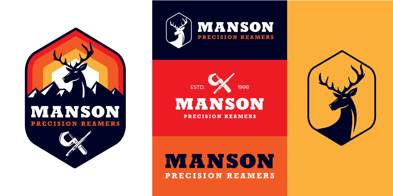
There’s likely not a single major brand that operates with a single logo, so why would you? Your logo is an essential piece to establishing your brand – along with your colors and messaging, is the main element that gives you any kind of brand recognition. A logo shapes your brand’s personality; it helps to build brand identity and it’s usually the first visual people can glance at to identify an entire company. Logos are so important when creating great branding across different mediums, allowing you to consistently reflect a brand’s identity in diverse contexts from websites and signage to emails and business cards. With your logo being viewed in several different sizes and mediums, you should a have the best variations for any use. The most common logo variations are: the primary logo, the secondary logo, the submark, the logomark and the logotype. You don’t need to make use of all of them however you should definitely make use of at least three variations.
What’s a logo variation?
First, a logo variation does not mean you have wildly different visual designs for every logo. A logo variation is a rearranged version of your primary logo design that allows your brand the flexibility to be consistent, and recognizable, in different placements. Every brand needs a set of unique logo designs to use on several platforms that are recognizable, versatile, and complement its overall identity.
For instance, if you only have a single large horizontal logo, how will it work as the profile photo on your social media business page? If you only have a small circular logo, what will you use on your website header? What about business cards? Banners? Letterheads? Merchandise?
Logo variations can include a range of colors, sizes, and formats. Your designer should design you at least three non-negotiable logo variations to help your brand look consistent no matter where you place it.
Using our client Manson Precision Reamers as an example, let’s take a look at each of the different logo variations!
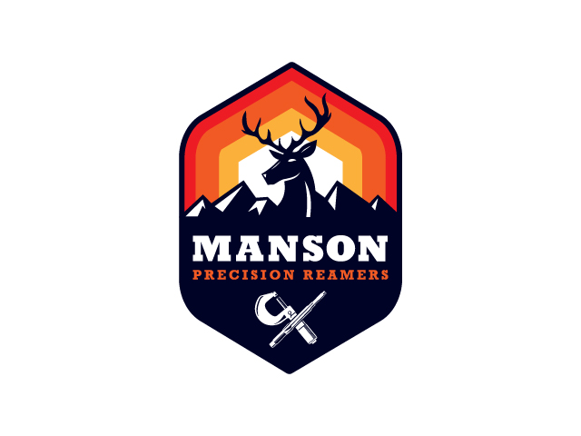
Primary Logos
The main logo as well as the origin for all other variations and usually the most widely used of the variations. Usually the most detailed, it’s a self-explanatory image of your brand, containing its illustration, wording, icons, and sometimes even location information. The primary logo is best used for large medium such as banners, websites, signage and brand documents.
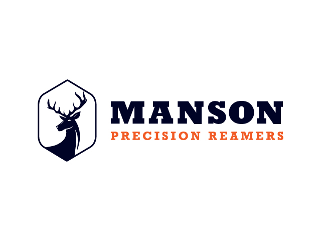
Secondary Logos
The secondary logo is a re-oriented layout of the primary logo, allows more flexibility of use and sometimes simplified. Depending on the industry in which you operate, having a secondary logo can be beneficial. These logos often serve as streamlined versions of your primary branding, either arranged vertically or horizontally to suit different needs. This variation can often be used for social media profiles, graphics, emails and business cards.
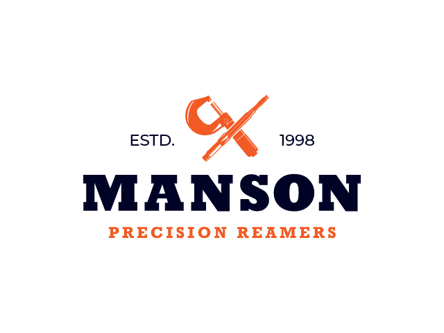
Submarks
This variation is a simplified version of the primary logo, sometimes in a circular of square layout. Submarks are a great way to differentiate your brand while also conveying credibility. These designs often feature the full business name or a graphic element however if you prefer something simpler such as just using your company initials, that’s known as a lettermark. This variation is best used for social media profiles or small print collateral.
Logomarks
The logomark, often referred to as an icon, is a shape icon or symbol to represent the brand and unique to the brand. Though, a logomark isn’t a must-have, it can be an extremely valuable asset. Having one in your arsenal allows you to have more variation and flexibility when branding situations arise. These marks are often used as graphical elements such as patterns.

Logotypes
Logotypes, or wordmarks, are typography-based logos usually just the brand name or initials. Developing successful logotypes require a combination of creative thinking and strategic planning. With name, typeface, and color being the only elements for people to absorb at first glance – make sure your business stands out from day one.
Honorable Mention: Favicons.
A favicon is a tiny visual representation of your brand that can make all the difference to users browsing your website – it adds an extra layer of personality and recognition as they navigate. These icons, no larger than 16×16 pixels in size, usually feature simple logos or text snippets providing key information at-a-glance.
Conclusion
Logos convey a unique identity and message for your brand, and a logo variation ensures that your crisp visuals remain recognizable even in tight or unusual placements. With a logo variation, you have the flexibility to adjust the elements of your primary design to better fit the desired space or scene.
Crafting a holistic brand identity requires more than just an attractive logo. To truly stand out, businesses need to develop their own distinct look and feel – think cohesive designs, harmonious colors, eye-catching elements and consistent photographic style that all combine to create powerful visuals with impactful messaging.
A primary logo, secondary logo, submark, logomark and/or logotype create the ultimate visual brand experience. When you’re ready, we can help you start the process of designing your logo suite. Our experienced creatives will lead you through the design journey from start to finish, ensuring a streamlined and smooth experience. We will make sure that not only your logo but your brand is represented in a way that speaks to who you are and connects with your target audience. Reach out to Smart Link Solutions, and we’ll be more than happy to offer beneficial and trustworthy insight!
