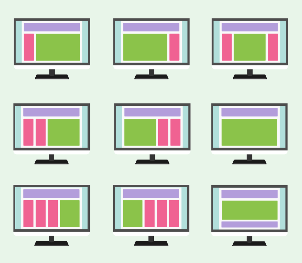
Like a restaurant, a poorly designed website can turn off potential customers. That’s why it’s so important to know key web design principles when creating or updating websites – to make sure the final product is a pleasure to frequent, inspiring people to come back again and again.
Let’s explore these design principles, and how they can elevate your business’s online presence.
User-Centered Design
This principle is, in many ways, the heartbeat of all successful websites. And it informs many of the other items on this list.
User-Centered Design (UCD) is just what it sounds like – it puts the user at the heart of the design process, keeping their needs and preferences top of mind at every stage. It’s not just about creating visually appealing websites, but crafting an intuitive, easy-to-use, and engaging digital experience.
The magic of UCD lies in its ability to instill a sense of familiarity and comfort, nurturing customer loyalty by creating profoundly engaging websites that stand the test of time.
Responsive Design
This innovative principle of web design ensures your website can adapt its layout and content to match the device used by your visitors.
Consider this statistic: more than half of all website traffic comes from people using mobile devices. That’s a staggering 55% of your potential customers! They’re navigating your site on the move, with not just desktop computers or laptops, but with smartphones and tablets.
Responsive Design ensures a seamless, hassle-free user experience that welcomes your customers to your business, no matter what device they’re using. This is the power and promise of responsive design.
Web Accessibility
Continuing on the theme of tailoring your business’s website to make more customers will feel welcome, web accessibility revolves around design choices that ensure people with disabilities can easily access and navigate your digital platform.
Interestingly, the benefits of a web-accessible site aren’t just confined to users with impairments. When it’s done right, it significantly enhances the overall user experience for everyone visiting your site.
Simplicity
“Less is more” is definitely true when it comes to web design. A simplified website easily guides your visitors straight to the content they want to find.
People are looking for an enjoyable, stress-free browsing experience – and that’s exactly what a simple, uncluttered website delivers.
Beyond being pleasant to the eyes, a minimalist approach also nails the practical side of things – it loads quicker and runs smoother, cutting down on needless waiting times and the risk of high bounce rates (when a visitor abruptly leaves your site to go somewhere else).
Faster Load Times
The clock is always ticking when it comes to your website’s performance. Because in this fast-paced, click-and-go digital world, time really is money.
A site that loads in just one second enjoys a whopping 40% conversion rate. For each additional second it takes the page to load, however, sales plummet. Not only that, but each second of delay also ramps up the likelihood that the visitor will bounce to another site.
Long story short: Quick load times are no longer an option, they’re a necessity. If your website is lagging, your business is lagging. Prioritizing quick page load times is a powerful tool in the web design bucket to ensure the growth of your business online.
SEO in Design
Sure, many people think of search engine optimization (SEO) as content strategy – but, in reality, it plays an influential role in design as well.
Think of it this way: A well-integrated SEO strategy in your web design is like giving search engines a GPS. Weaving in features like responsive layouts and clear navigation structures helps search engines to index and “crawl” your website more effectively. Every line of code becomes an opportunity to enhance your site’s rankings, making it more visible online, and drawing in more customers.
The Hierarchy of Content
Even though the name of this web design principle sounds a bit complicated, its meaning is simple: Arranging information on your website in a way that helps people sail effortlessly through your website, finding exactly what they need.
For instance, you’ll want to place the most crucial information at the top, much like the cherry on a cake. Bigger fonts act like a spotlight, drawing attention to words or images that matter the most.
Also, imagine your website as a virtual home. You want visitors to find the bathroom without having to trek through the entire house, right? The same applies here. Keep every page just a click or two away from the end goal – in this case, a golden conversion opportunity.
The Power of Web Design
It’s simple, yet powerful principles like these that turn a good website into a great one!
Already have a website? Want to see how you are doing? Click here and scroll down to the “Get Your Free Website Analysis” section and fill it out. It looks at six different areas and gives you a rating.
Take your web presence to the next level with Smart Link Solutions! We’ll blend your vision with our expertise to create a website that looks amazing, and converts visitors into customers.
Connect with Smart Link Solutions today and see why our personalized service makes all the difference.


